Inside Angle
From 3M Health Information Systems

How are my numbers? Analyzing your CAC data – Part 2
In my last blog, I discussed the importance of making valid data comparisons when trying to analyze the impact of computer-assisted coding. I used my own experience in charting my progress as a runner as an example of how to begin answering the question, “how are my numbers?” So with part two of this blog, let’s look at some real data!
When our team first put together CAC performance metric reports for customers, we wanted to make sure we could make valid comparisons across our customer base. At the same time, we had to work with the data we could access. When it comes to measuring productivity within HIM departments, there are many different “formulas” in use out in the industry. A common measurement is charts coded per hour, day or week. However, interpreting that data for a particular coder within a particular site requires knowledge of factors we aren’t able to “see” such as differences in full/part-time status, vacation time, sick time and time spent on other activities like training or meetings. As discussed in part one of this blog, variables should be considered in any analysis. Since we don’t have visibility into a number of these factors, we instead chose to analyze the average minutes spent coding a chart. This metric removes all of those other factors and is focused on how much time is spent on the activity of coding.[i]
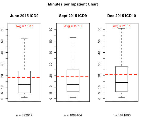
One of the big concerns leading up to ICD-10 implementation was the impact of the new code set on coder productivity. Using CAC data from more than 900 3M client sites, let’s take look at productivity results.
Graph 1 shows the average minutes of coding per chart for three months: June 2015, September 2015, and December 2015. I chose not to contrast September vs. December because we know that as the transition date approached, more and more facilities were doing some form of dual-coding. Many sites were doing this as early as June, but far fewer. In fact, Graph 1 indicates that there is a slight increase from June to September, which can largely be attributed to the increase in dual-coding. Because of this, we don’t want to include September in our comparison; it’s included here just for reference. I also didn’t use October or November because these months were too close to the actual transition date. The further we are from the October 1st transition, the more settled the numbers will be as the initial learning curve levels off. Reviewing December 2015 will give us a more accurate comparison with last June.
Using these months, we can see that there was an average increase of 2.7 minutes per inpatient record from June to December 2015. So on average, our CAC customers have seen a 15 percent increase in time per record (21.07-18.37)/18.37 now that we are three months out from the transition.
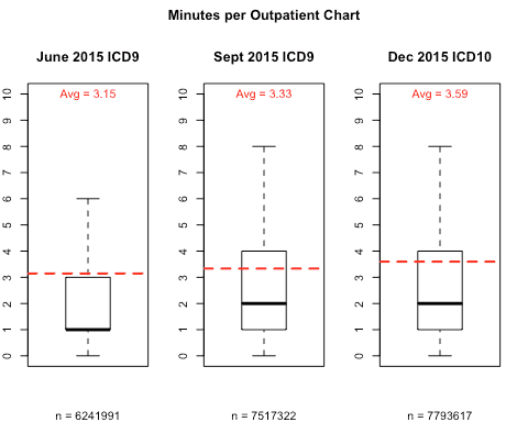
Now, let’s take a look at outpatient coding using the same methodology as above. One difference to keep in mind is that outpatient code sets did not change for procedure coding. With only a few exceptions, outpatient procedures are still generally coded using CPT codes. While CPT procedure codes are a small percentage of overall codes, this still means there was a portion of outpatient coding that was not affected by the ICD-10 transition. Again, this is a variable we have to take into account when analyzing outpatient coding productivity.
If we look at Graph 2 below, we can see that the average time spent coding per outpatient chart has increased from 3.15 minutes in June 2015 to 3.59 minutes in December 2015. This is an increase of about 14% which is similar to the inpatient increase. However, if outpatient procedures had been affected by the change, this increase might have been higher.
Looking at the time increase in coding charts made me wonder how we might get some insight into the reasons behind the increase. We all know that increased specificity was one of the major justifications for the move to ICD-10. While it is still too early to make significant use of the increased specificity, I reasoned that we should at least be able to see that more specificity is in fact being captured. To do this I just took a quick look at the number of unique codes being captured in an average month by more than 900 CAC customers, both before and after the transition.
Graph 3 below indicates the number of unique codes that were used on both inpatient and outpatient charts for the month of September 2015 compared to December 2015. Because we can separate out which code set a code belongs to, we can use the month of September in our analysis. We factored out any codes that were a result of dual-coding simply by removing any ICD-10 codes from the September data. One other important point: only diagnosis data is represented in the outpatient data. Given that procedure coding stayed largely unchanged, this comparison is just between ICD-9 and ICD-10 codes.
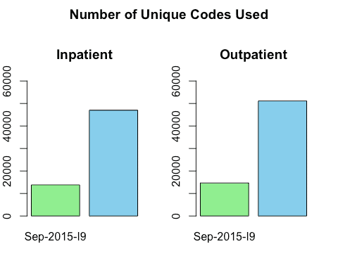
At a glance you can see that in the case of both inpatient and outpatient codes, there is a dramatic increase in the number of unique codes being used to code records in ICD-10 compared to ICD-9. It stands to reason that the learning curve associated with ICD-10 would account for some of the increased coding time. While it’s still too early to draw many conclusions from the ICD-10 data, it’s worth noting that the data is behaving how we would reasonably expect it to, so far.
I also think it is fun to now be able to put real data behind what industry experts predicted would happen. Minimizing the productivity impact of the transition was a major focus of hospitals and vendors alike and so it’s nice to see that, for this group of 3M CAC customers, the impact was not as eventful as some industry predictions. If you are a 3M customer and are wondering about your numbers, grab your Performance Metrics report from the 3M client support site and take a look!
Jason Mark is a business intelligence architect with 3M Health Information Systems.
[i] On a side note, for anyone who wants to translate this metric back to “charts per hour” the math is pretty easy: 60 minutes in an hour / average minutes per chart = Charts per Hour Charts per day would just be: (60 minutes in an hour * number of hours worked by the coder) / average minutes per chart = Charts per Day


Jason Mark
Manager
Jason Mark is manager, Research & Applied Data Science Lab for 3M Health Information Systems, Inc. Jason has been with 3M HIS since 2005. Prior to his current position, Jason…