Inside Angle
From 3M Health Information Systems
How are my numbers? Analyzing your CAC data
I’m excited to post this next installment in our blog series about using data to better understand and improve your computer-assisted coding (CAC) performance. Our team looks at a LOT of data and we get a LOT of questions. We hope this blog series will give us a chance to answer questions for a LOT of people!
One of the most common questions we hear after reviewing data with a customer is some variation of “How am I doing?” or “Are my numbers good?” These can be challenging questions to answer, and sometimes the best answer is “It depends.” When determining whether or not a number is “good,” there must be a number to compare it to. A good number is always relative to some other number and may have a very different meaning depending on the number used for comparison. Before I jump into what this means for coding, let me illustrate with an example I think about a lot in my own life.
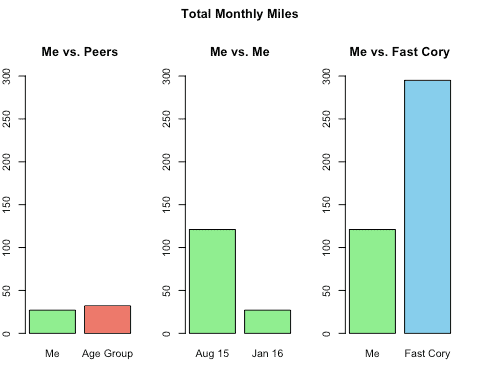
I like to run and I use running as an important part of staying healthy. My GPS watch tracks my miles and every time I complete a run, my watch shows my total miles for the last month. The meaning of that number changes dramatically depending on what it is being compared to. In the graph below, let’s take a look at my mileage data and the different ways I can think about my performance.
Comparison vs. Others Like Me: The far left graph shows my mileage for the month vs. other males of my same age range. There are many variables that factor into how many miles one can run in a month. This comparison attempts to control these variables, specifically gender and age. It helps me understand that with factors of age and gender being equal, I’m doing pretty well this month relative to others like me.
Comparison vs. Myself: The middle graph compares my mileage for last August vs. January of this year. At first glance, it doesn’t look like I did very well in January. Keep in mind, however, that this comparison does not explain or control for ANY of the variables needed to explain the drop in my mileage as the previous graph did with age and gender. This comparison is only valuable when I add proper context around factors such as training time, injuries, winter weather, travel or lack of self-discipline through the holidays (I’m not telling!) Yet, this graph is informative because it tells me what is possible based on what I’ve been capable of in the past. In order to make this kind of comparison, I have to track my data and I need to have baseline information to compare against.
Comparison vs. Top Performer: the last graph on the right compares my monthly mileage to an acquaintance of mine, “Fast Cory,” who runs ultramarathons (races typically ranging from 50-100 miles long). If I were trying to run ultramarathons, I could use a comparison like this to understand where my training is compared to a “benchmark” established by a top performer. The first graph showed how I compare to the average performance of someone like me, but this one shows me something I can aspire to. Of course, to actually achieve the same kind of mileage, I’d have to account for factors that are preventing me from being at that level today such as time commitment, mental and physical strength, and so on.

Here are a few things to keep in mind when it comes to making similar comparisons with computer-assisted coding data.
Comparisons vs. Peer Groups: There are an enormous number of variables across health care facilities. Just a few that might affect CAC performance are number of hospital beds, specialty services offered, EHR vendor, percentage of documents that are scanned or handwritten, mix of outsource coding vendors and so on. When possible, we will show data that takes these variables into account so you’re able to make informed comparisons between your own performance metrics and data from similar organizations.
Comparisons vs. Self: Comparisons across your own CAC data will require the most work on your part, but will provide the most meaningful information. To be able to make comparisons within your own data, you first have to track the data points you want to compare over time and, second, keep track of significant events as they occur, as these events may explain changes you see in your data. Events could include shifts in volume or case mix, staffing changes such as the addition or removal of outsource vendors, implementation of new systems that feed data to your computer-assisted coding system, interface problems, changes in document types or templates and so on. Proper context is key to understanding your performance over time.
Comparisons vs. Benchmarks: Benchmark comparisons are useful in that they show you “what’s possible” given ideal conditions. They’re much like comparisons vs. peers but with an emphasis on higher performing peers rather than “average” performers. Whether your facility is above or below benchmark performance, many of the factors that influence comparisons with peers may also explain the gaps between your data and benchmark data.
Now that we’ve established our own benchmark for understanding CAC performance, it’s time to look at some real data. In part two of this blog, coming next week, I will dig into data from our customers and discuss meaningful ways to measure coder productivity.
Jason Mark is a business intelligence architect with 3M Health Information Systems.


